Design System
Precision. Preservation. Performance.
This brand bible is the signal system for EVOLVE ECO SURFACE PREP & RESTORATION. It unifies story, visual identity, and the psychology that converts decision makers into committed clients.
Use the full lockup on dark backgrounds. Maintain clear space equal to the height of the tree symbol.
Backcountry Cyberpunk
Brand Bible Index
Part 1: The Brand Manifesto
1.1 The Origin: "The Oddly Aesthetic and Mysterious Tree-Lined Metallic E on the Coffee Mug"
The industrial landscape is littered with terrible logos. It is a sea of clip-art rooftops, screaming cartoons, and generic gears designed to be legible on a dirty van doing 60mph. This is "Corporate Noise." The assumption is that if you work with your hands, you do not care about aesthetics. We reject that. Just because the work is hard does not mean it has to be ugly. People want to go to work and be happy; they do not want to stare at ugliness all day.
EVOLVE is the Signal. Our emblem is the oddly aesthetic and mysterious tree-lined metallic E on the coffee mug. It is the unexpected object in the room that forces a question. It is designed to be worn on a matte black hoodie in a local coffee shop, not just on a safety vest on a job site.
When someone sees the Evolve logo, the Tree, the Kinetic Swish, the Metallic Sheen, they should not think "Oh, a sandblaster." They should think, "That looks like a tech startup," or "Is that a skate brand?" This curiosity is our marketing funnel.
The Question: "What is that brand?"
The Answer: "We are a surface strategy agency. We restore infrastructure using recycled glass."
The Result: A boring trade becomes a fascinating story.
1.2 The Context: The High-Tech Frontier
We operate in Alberta, the untapped wild west. We are born and bred in this industry. We grew up in the oil patch and the Boreal forest. We respect the old way, the grit, the long hours, the handshake deals, but we are here to update the software.
Our office is the backcountry. We work on rugged job sites where the Northern Lights dance overhead and the air is crisp enough to freeze breath. We are the intersection of old industry and new tech. We bring surgical precision to the wildest landscape on earth.
1.3 The Philosophy: Industrial Rebirth
The world is full of damaged history, rusted tanks, graffiti-covered heritage buildings, weathered fleets. The industry standard is to blast it with toxic grit, making a mess and damaging the surface.
We are the Reset Button. We represent rebirth. We strip away the layers of neglect, history, and abuse to reveal the "Day One" pristine surface underneath. We do not just clean; we evolve the object back to its original potential.
Part 2: The Visual Identity (Decoded)
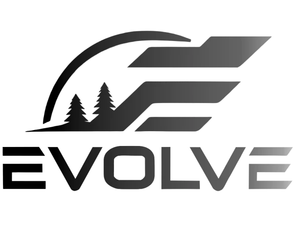
Our logo is not a stamp; it is a diagram of our philosophy. It is a piece of industrial jewelry.
2.1 The "E" (The Engine)
The symbol: the stylized letter E. The meaning: evolution. It represents forward motion. We do not just restore the past; we evolve the surface for the future. It stands for the technological leap from sandblasting to surface strategy.
2.2 The Tree (The Protected Core)
The symbol: the organic tree silhouette nestled in the center. The meaning: the substrate and the environment. The paradox: heavy machinery usually destroys nature. Our logo puts the nature inside the machine. The promise: we strip the rust but save the steel. We blast the paint but save the brick. We work in the park, but we do not kill the grass.
2.3 The Kinetic Circle (The Aurora Swish)
The symbol: the swish or circular trail that wraps around the tree. The meaning: controlled chaos. This is the blast trail. It represents the millions of recycled glass particles flying at supersonic speeds. The visual twist: the swish often glows with a gradient, representing the Aurora Borealis wrapping the rugged landscape.
2.4 The Aesthetic: "Backcountry Cyberpunk"
We bridge two worlds: the rugged wild and high-tech sci-fi. Think Blade Runner meets The Revenant. We use neon greens, deep voids, and high-contrast metallics, but place them against a forest at night. We are the new guard, armed with lasers and recycled glass, working under the stars.
2.5 Field Application: Name + Signal
On trucks, equipment, collateral, and uniforms, the company name stays visible and primary. Clarity matters in operational environments.
The logo is a standalone bat signal for the curious and bored in the oil patch and commercial hallways. It draws attention first, then the name closes the loop.
Merch is a gift with impact after a quick conversation with a secretary at a company we want to land a multi-million-dollar contract with.
Part 3: Color Physics & Psychology
Our palette supports the dark mode aesthetic. We do not use white backgrounds. We use the void to make the content glow.
This is the Alberta sky at 2:00 AM. Avoid pure black to retain premium depth.
Nature's electricity. Represents bio-friendly power and active process energy.
Primary text. Precision tone of clean steel and surgical tools.
Secondary text. Oxidized metal, quiet hierarchy.
System accents, CTA glow, and HUD-like cues.
Part 4: Texture & Atmosphere
4.1 The Digital Anchor Profile
Our website is never perfectly flat. We use a global noise overlay that sits on top of the entire experience. This represents the blast media and simulates the microscopic cloud of particles in the air during our process.
Tactility: Pure black screens feel slippery and soulless. The grain adds grip, making the brand feel heavier and more grounded.
The anchor pattern: We blast steel to create an anchor profile so coatings can stick. This digital grain is our brand's anchor profile. It ensures the message sticks in memory.
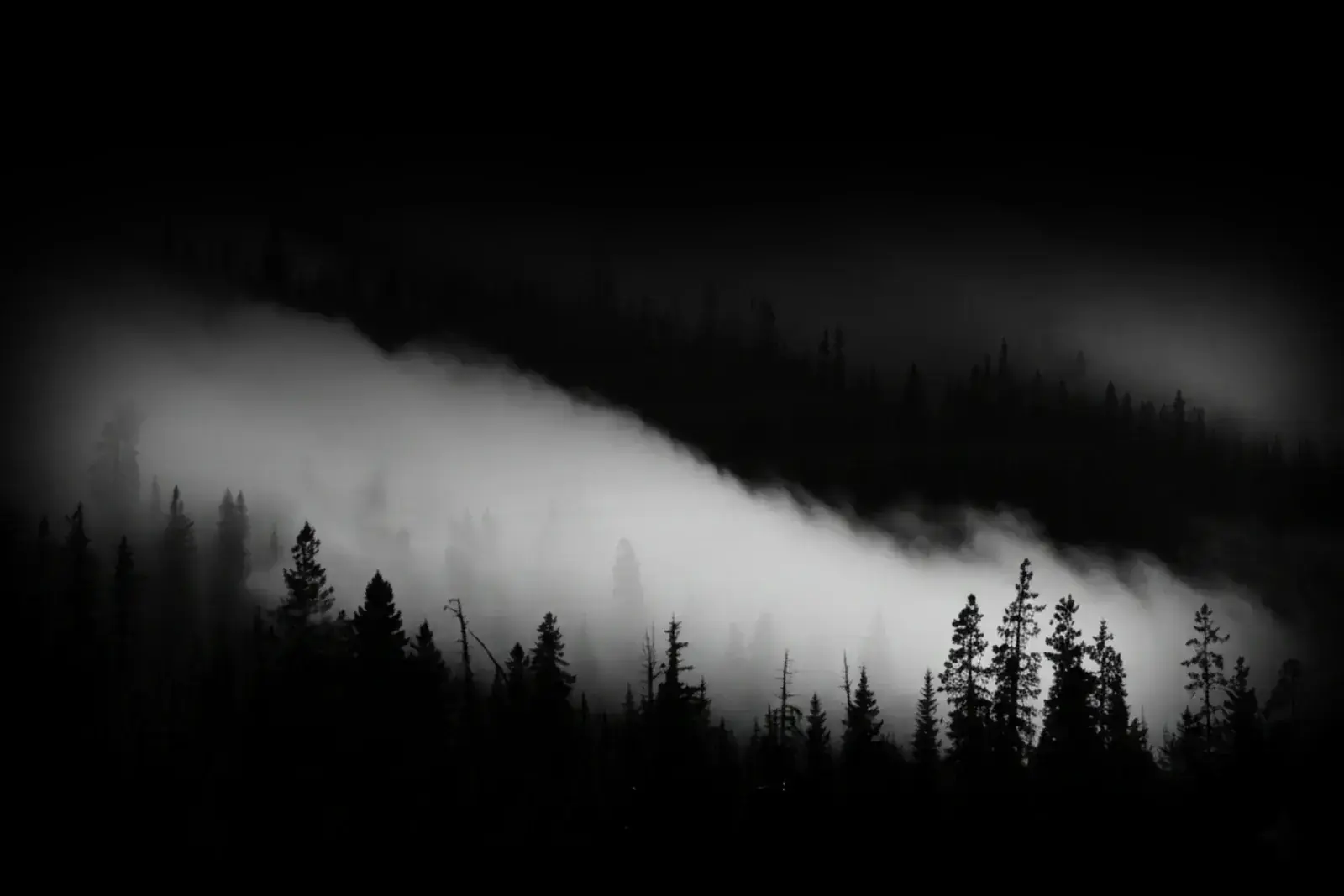
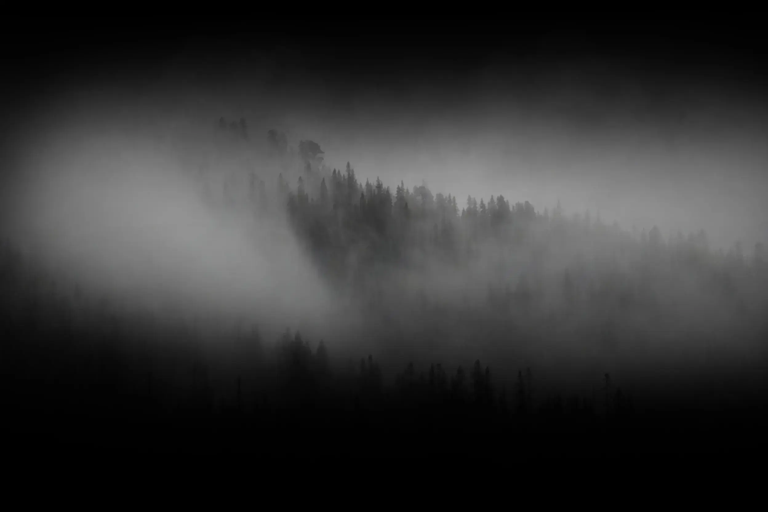
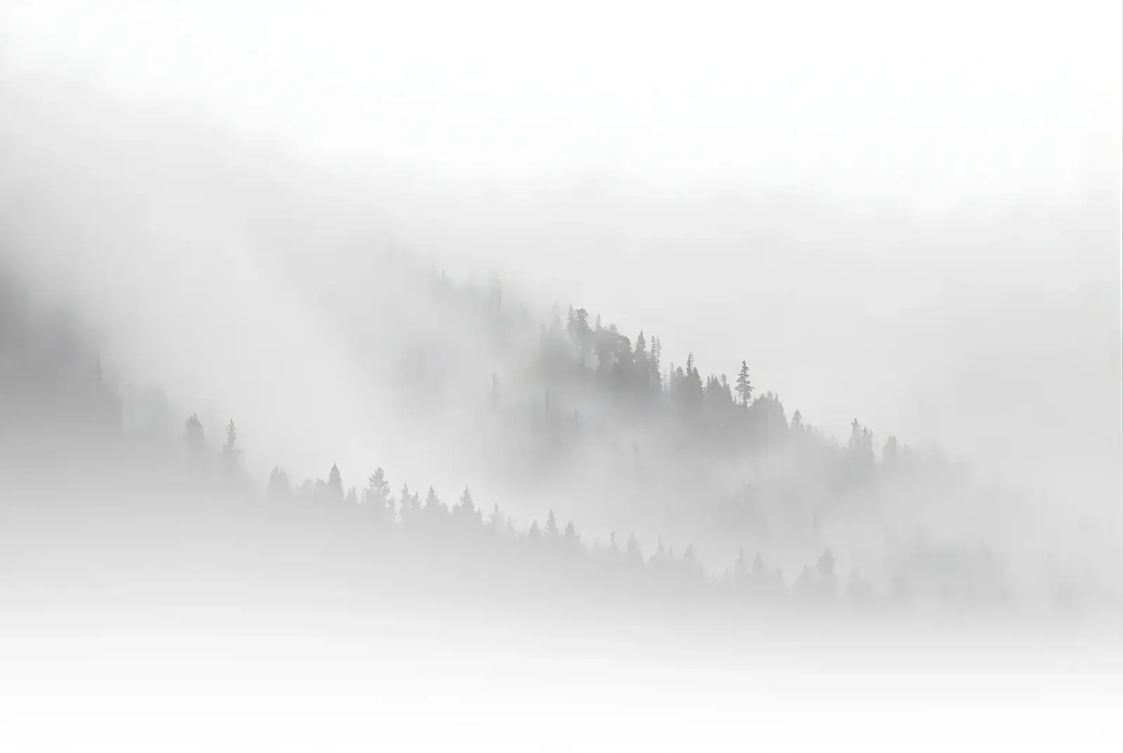
4.2 The Backcountry Imagery
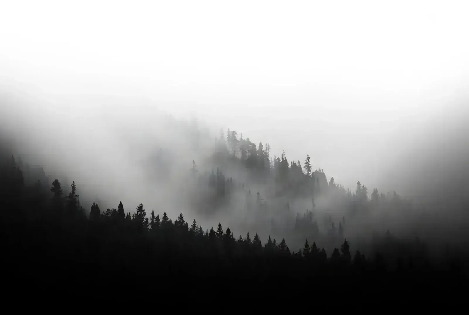
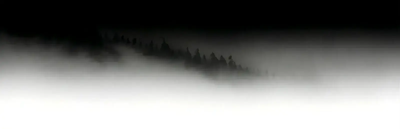
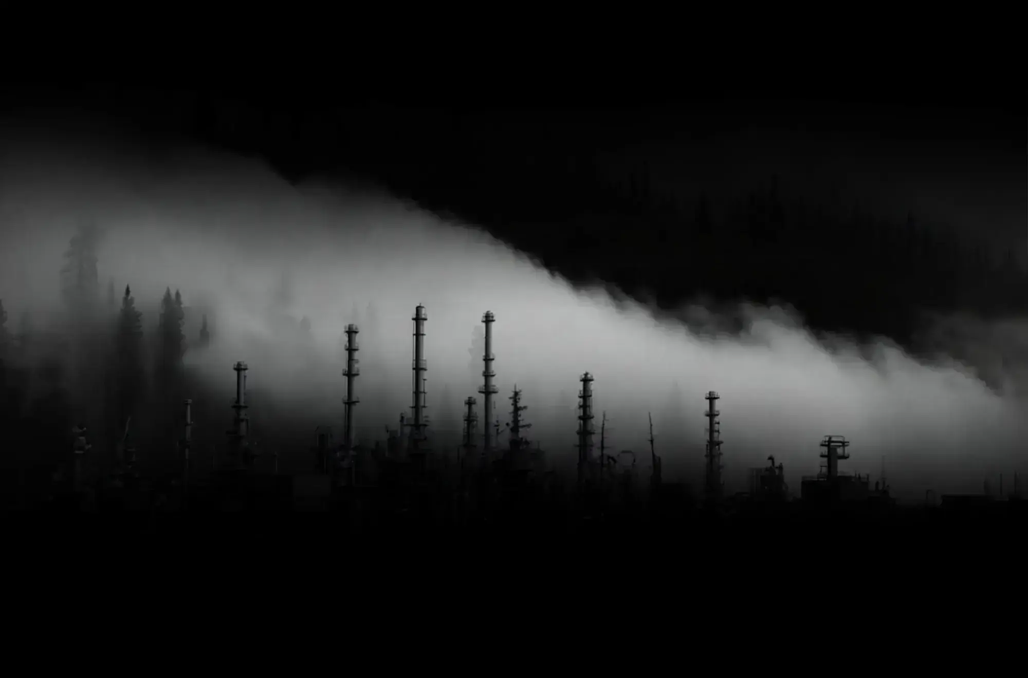
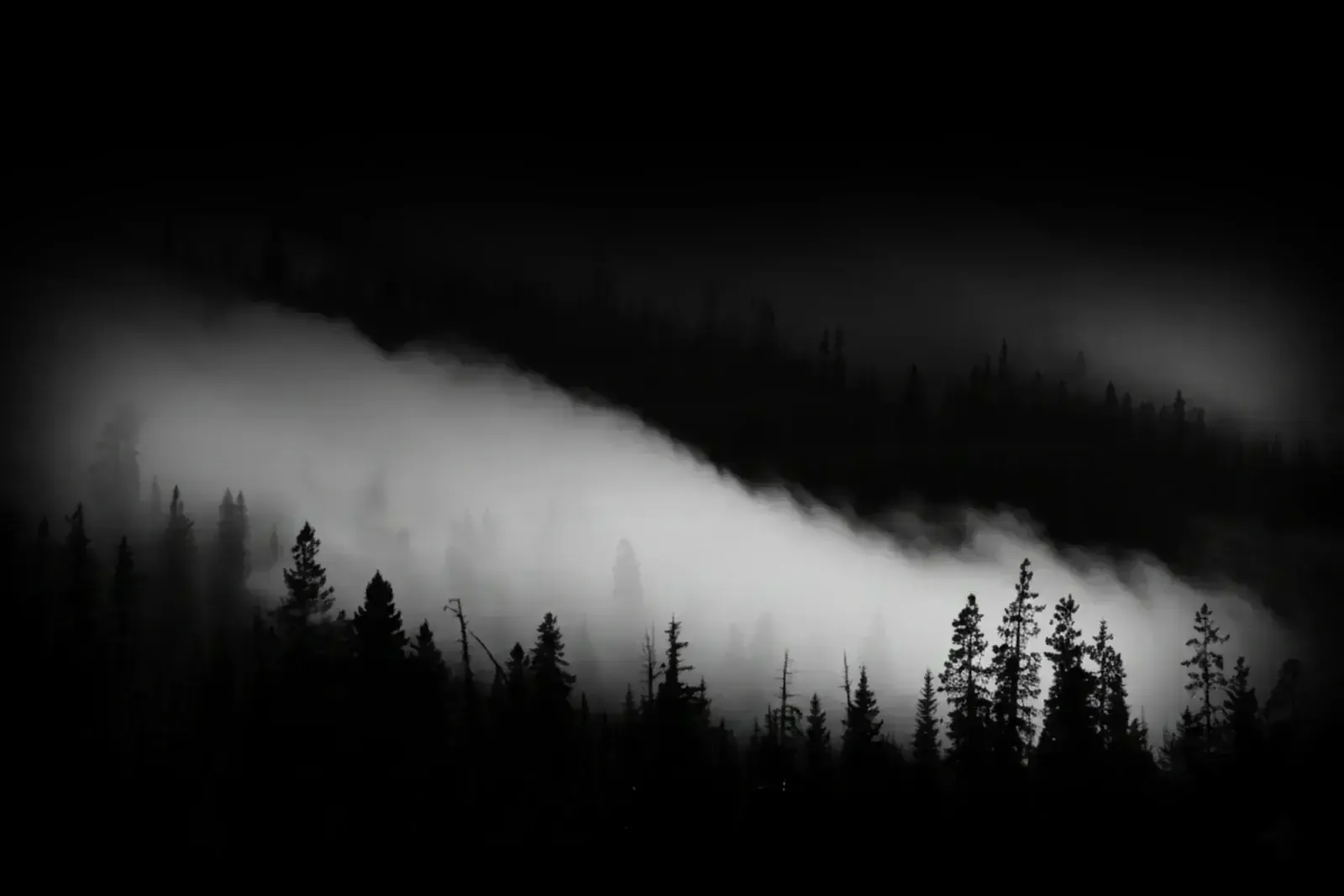
Aspect ratio: favor 21:9 or cinematic crops. The subject: show the forest behind the wall. Show the breath in cold air. Show the truck under the stars. Highlight the contrast between rugged environment and high-tech process.
Part 5: Typography & Text Rules
Precision. Preservation. Performance.
Objective: the font has no personality so the message has all the power. The type should feel tall, upright, and architectural.
5.2 Hierarchy & Sizing
H1: Uppercase, bold/heavy (700). Tight tracking. Size: 4.5rem and above.
H2: Uppercase, medium (500). Size: 2.5rem.
Body: Regular/light (300). Line height 1.6. Size: 1.125rem.
5.3 Syntax Rules
- No exclamation points. Confidence does not shout.
- Oxford comma is required.
- Say "Substrate Profiling" instead of "Cleaning."
- Say "Abrasive Blasting" instead of "Sandblasting."
Spacing as Luxury
We use air to convey premium positioning. Cheap brands cram text together. We let it breathe.
Part 6: The Merch Strategy (Streetwear Protocol)
6.1 The Low Key Approach
The garment: heavyweight matte black hoodies (400gsm), oversized fit.
Front: small embroidered logo on the left chest (tone-on-tone black or silver).
Sleeve: small "EVOLVE" text near the cuff.
Back: large graphic art (the kinetic circle) using puff print for texture.
Forbidden: no phone numbers, no website URLs, no list of services.
The Goal
We are selling a lifestyle of restoration, not a billboard. We are an industrial cleaning company, but we operate with the aesthetic of an underground streetwear label. We do not do "swag." We create mementos.
Conversation Starters
When people see our name, they should not immediately know what we do. They should want to ask. Our gear is designed to be worn on a Saturday night, not just a Monday morning.
The Alberta Standard
Rugged, premium, and understated. Heavy mugs you want on your desk. Hats that break in perfectly. We deliver items people love to display, keeping Evolve front and center by choice, not obligation.
Part 7: Audience Translation
7.1 Target: Industrial (The Skeptic)
Vibe: technical, brief, compliance-heavy.
7.2 Target: Commercial (The Visionary)
Vibe: aesthetic, efficient, brand-conscious.
7.3 Target: Residential (The Protector)
Vibe: gentle, respectful, trustworthy.
Imagery Companion Guide
Image System Overview
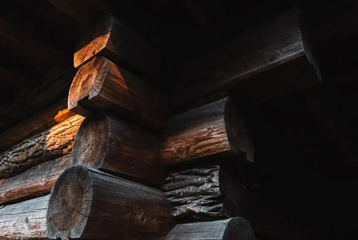
All imagery should reinforce the backcountry cyberpunk aesthetic: rugged, high-contrast scenes with visible texture, cold air, and engineered precision. Favor cinematic crops, deep shadows, and grounded environments.
Color grading: cool blacks, neutral grays, and a restrained green accent. Avoid warm orange or oversaturated blues unless tied to real lighting.
Usage Rules
- Backgrounds: cinematic, abstract, and atmospheric.
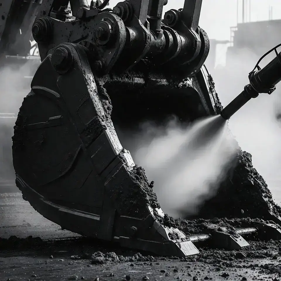
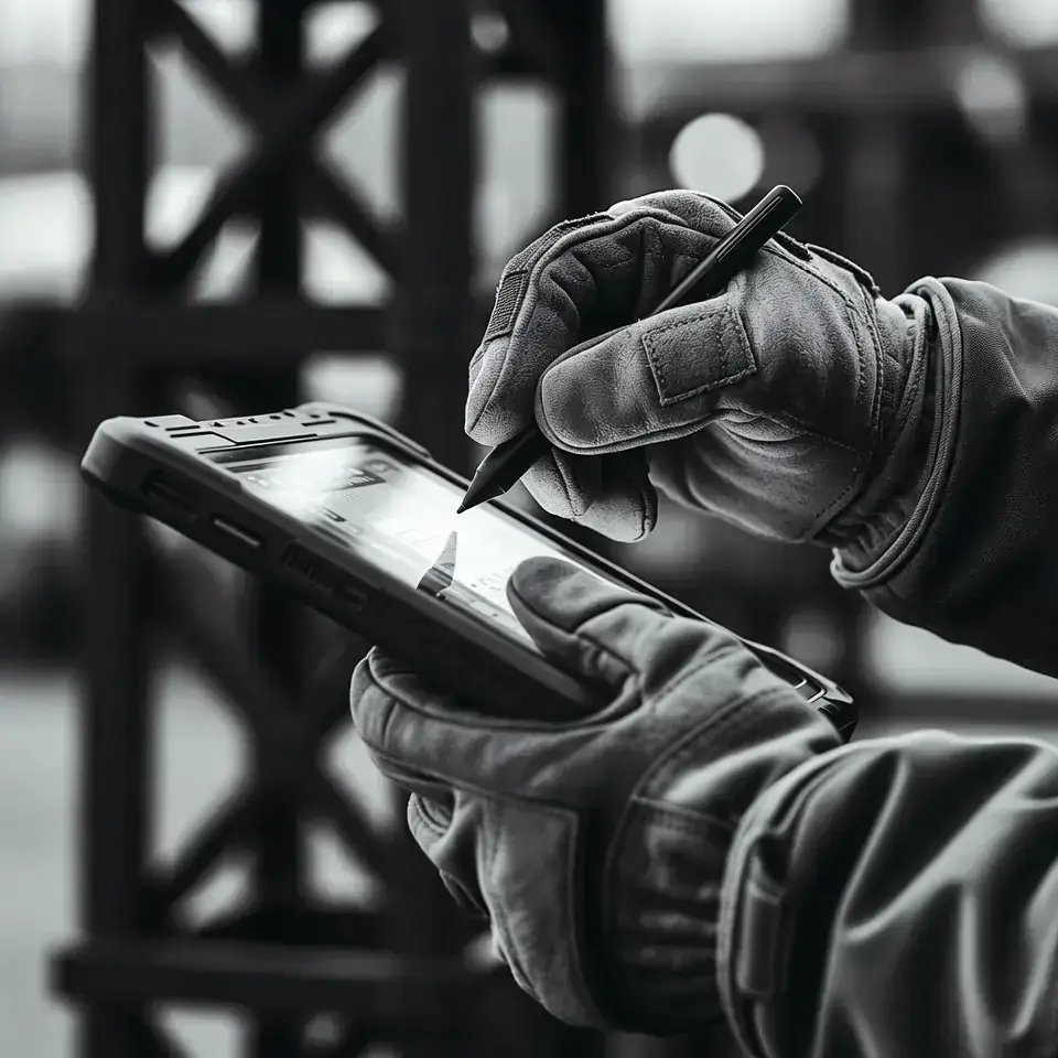
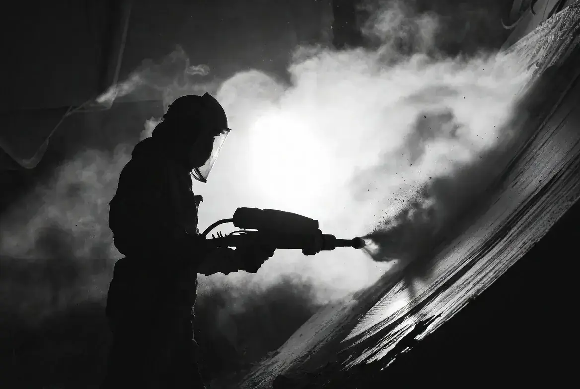
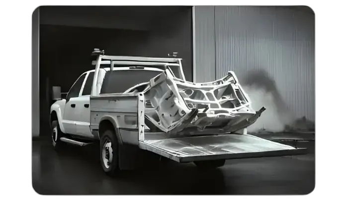
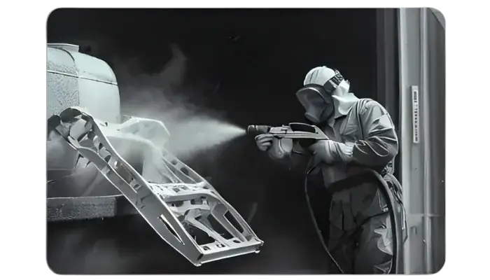
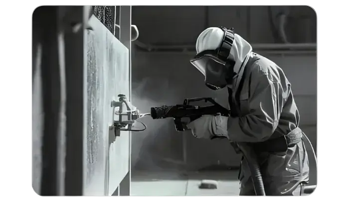
- Process imagery: show tools and surface detail in action.
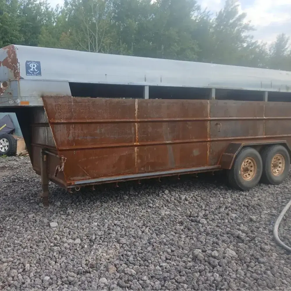
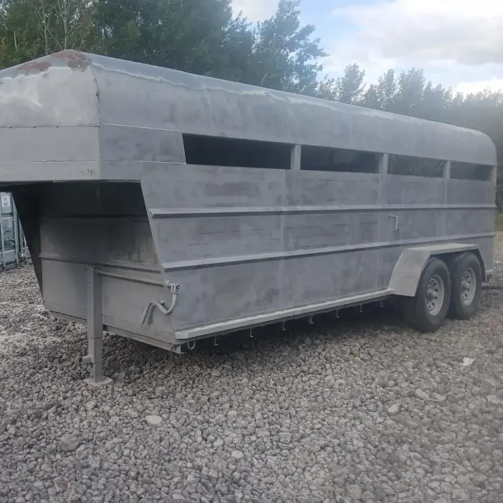
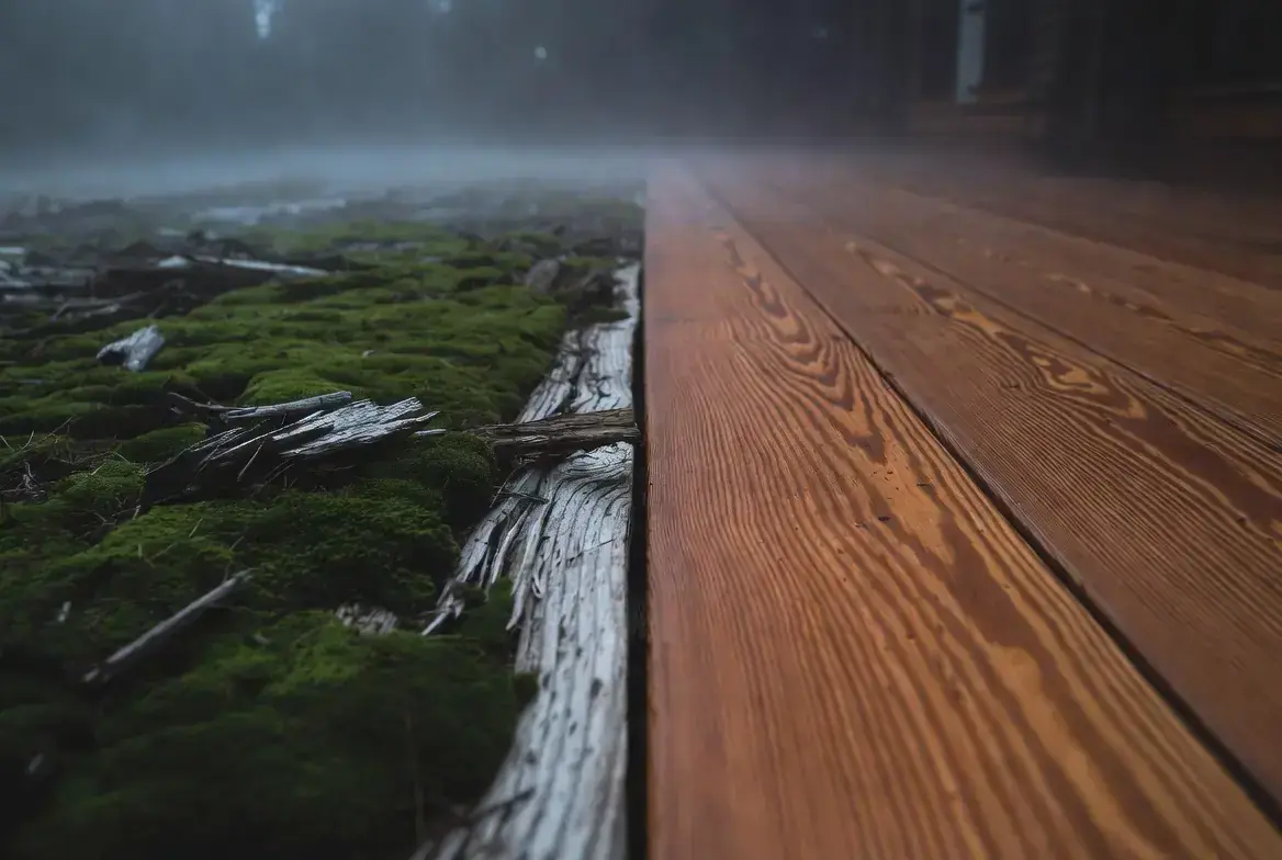
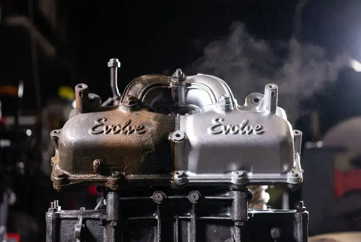
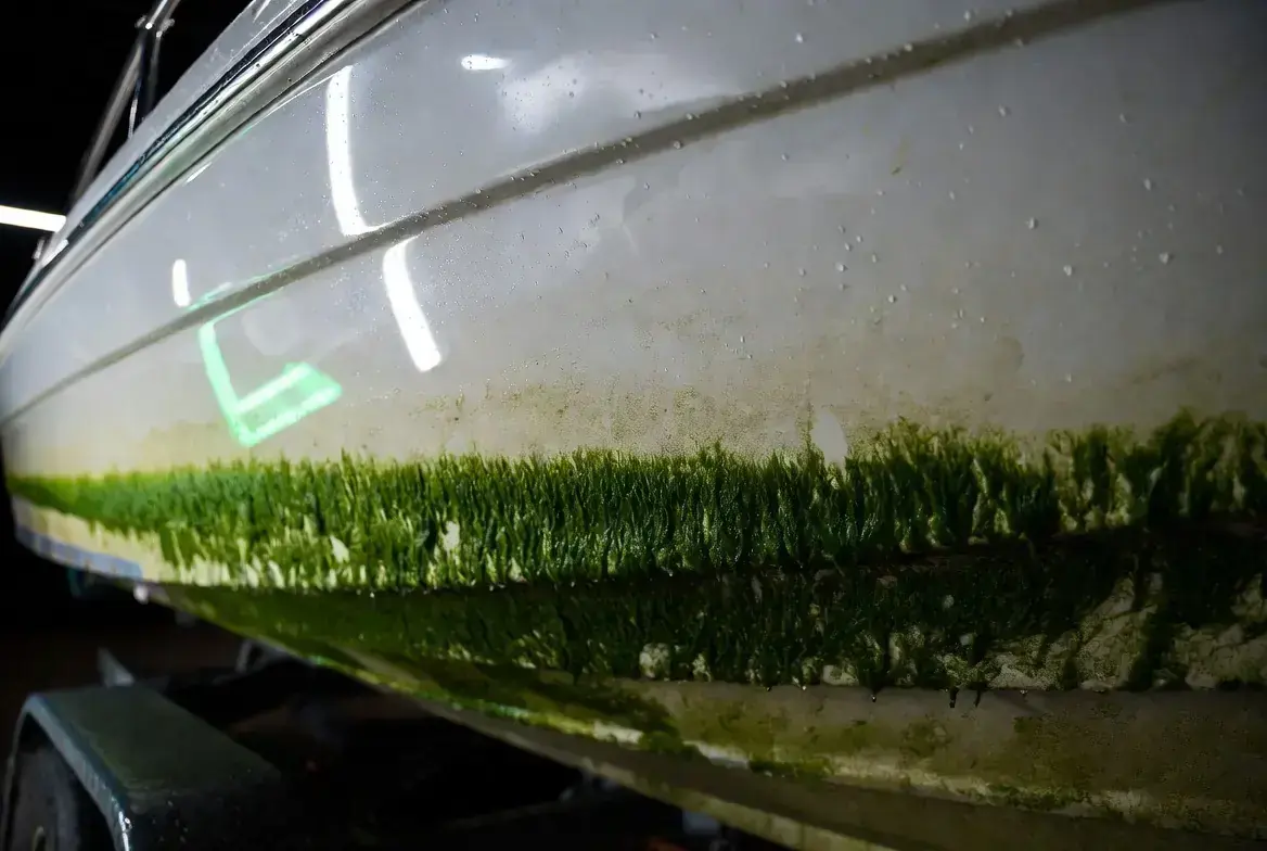
- Before/after: pair as proof, keep lighting consistent.
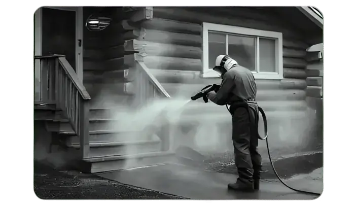
- Residential: show care, craftsmanship, and safety.
- Commercial: show scale, facade, and brand uplift.
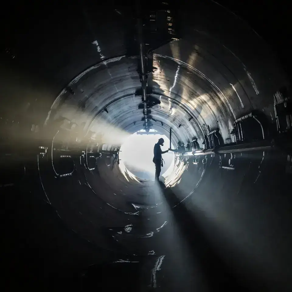
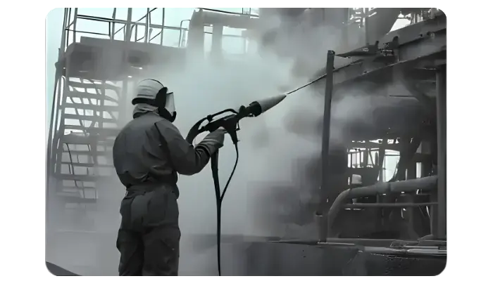
- Industrial: show risk, containment, and compliance.
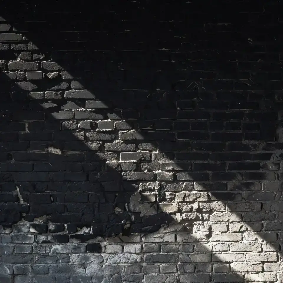
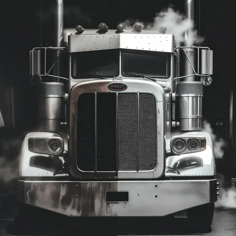
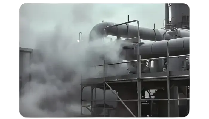
Backgrounds (Atmosphere)
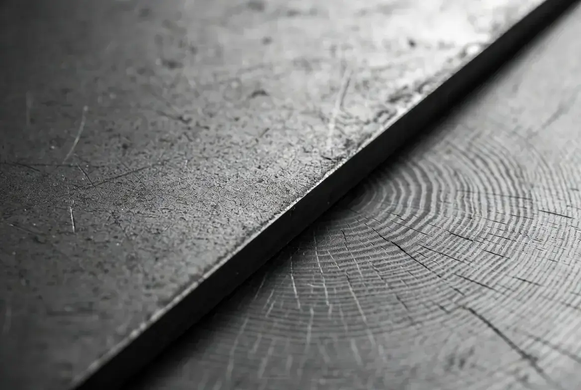
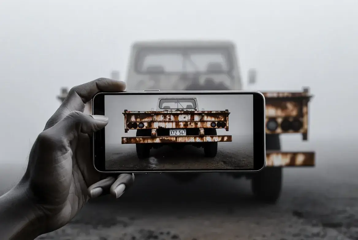
Before / After Proof


Commercial Portfolio
Industrial Portfolio
Residential Portfolio
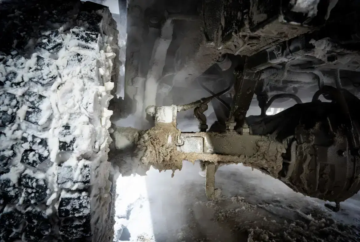
Process and Service Detail
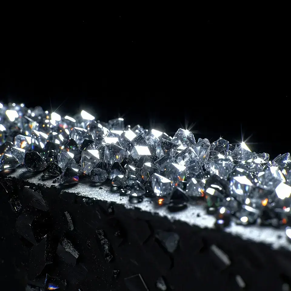
Iconography
Psychology & Beneficial Impact
We are building a memorable brand people like. It brings interest and stands out in a sea of gritty, boring oilfield and construction contractors. That translates to emotional engagement, more calls, and loyalty, assuming we do a great job.
Unexpected aesthetics trigger curiosity and slow the scroll. This increases qualified inbound attention.
Dark mode, disciplined typography, and glass overlays position EVOLVE as a specialist, not a commodity vendor.
High-end visuals repel price shoppers and attract decision makers who value quality, safety, and control.
Order, structure, and kinetic cues signal compliance and competence, lowering decision friction.